|
0 Comments
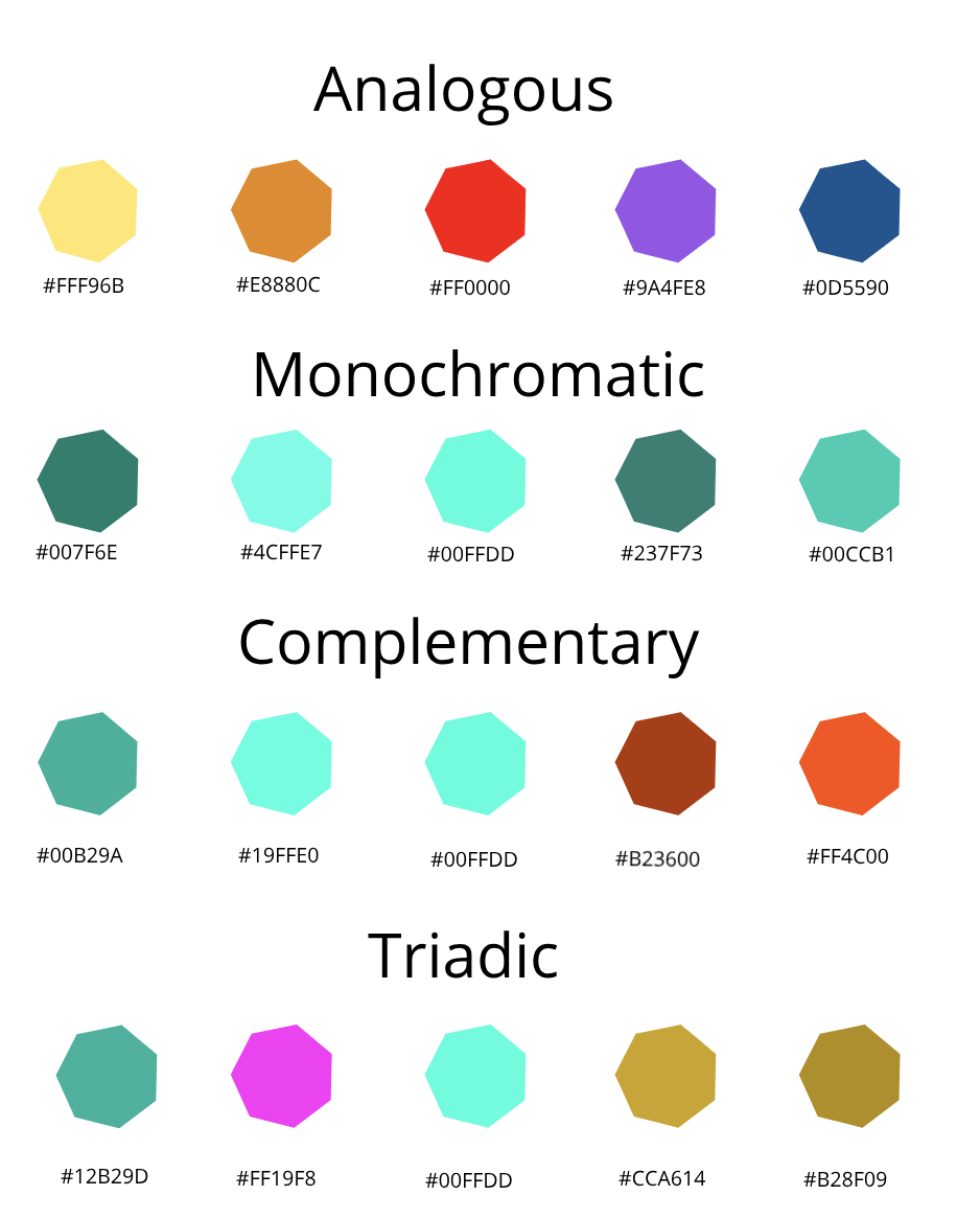
For this portion of the assessment, we were supposed to create three different variations of our three logos which resulted in 9 different logos. The most frustrating part of this project was when I had to come up with the logos because I really had to dig deep and find stuff that represented me. The favourite thing about the whole process who to see the end result because that looked great and showed all the hard work I put in. Something I learned from this whole experience was that improved on my tracing skills, while I was tracing my logos. 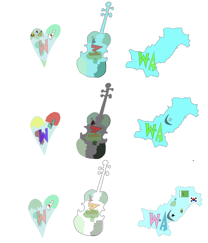 This logo represents me because it shows that I love travelling, I am from Pakistan, I play the violin I love food and that I live in Korea. This logo I think shows a lot about me, and that's why I chose this one over all the other 8 logos. I from the start knew that I wanted to show my country and where I am from in it so then I ended up adding the map of Pakistan. 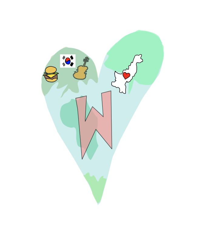 I choose three logos, which show where i am from, and what defines me. The first one shows that i play violin my name is Wareesha and i like traveling the world and am from Pakistan. The second one shows that i am from Pakistan and shows the cities that i have lived the most in Pakistan. The last once shows that my name is Wareesha, shows a mosque which tells that i am a muslim and shows that i like traveling. The three logos that i picked are the ones i like the most out of all of them. I really enjoyed makinng the logos. 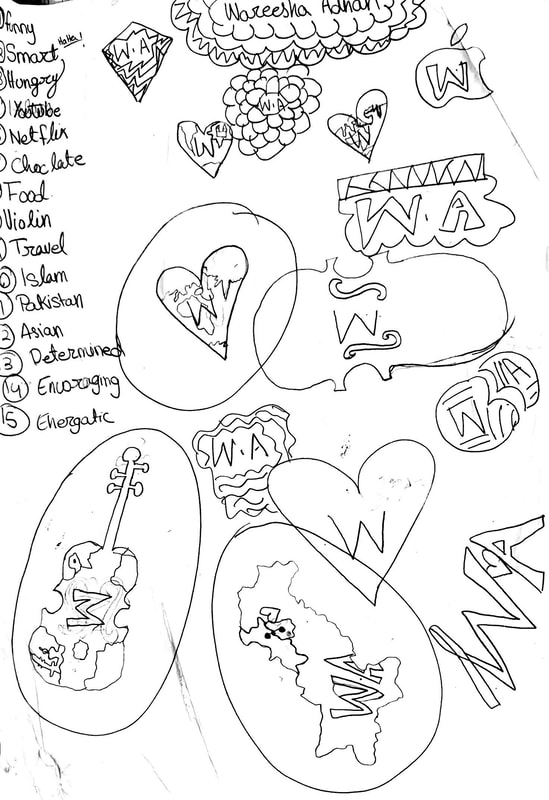 In this assignment we had to create four different color schemes using Adobe color. The color schemes we had were:
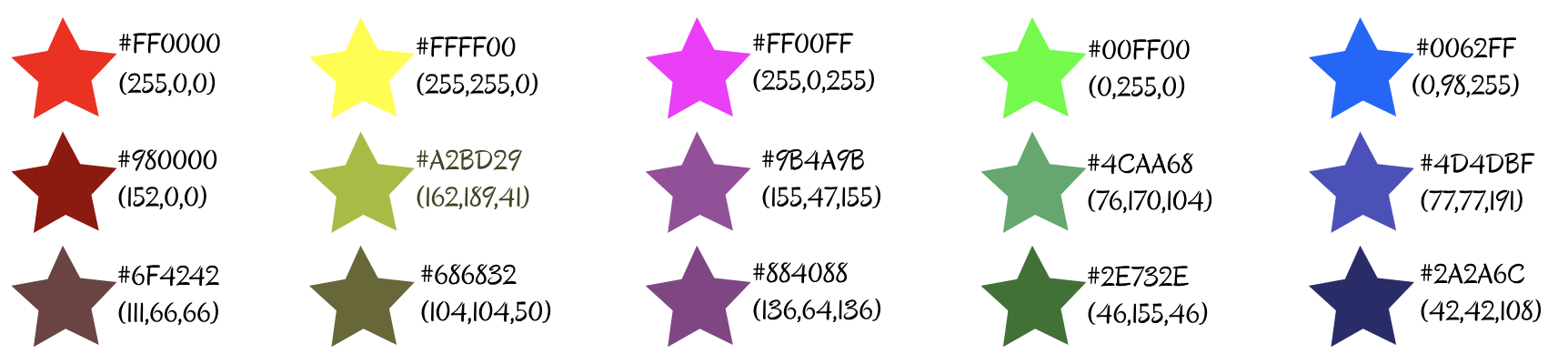
 In this asesment i was asked to display 15 different colours. And fill them in a shape, it can be any shape.We were asked to include.
 In this activity we were supposed to use 10 fonts and write two words in the fonts, one of the word was supposed to match the font and the other was a word that would not match the font. 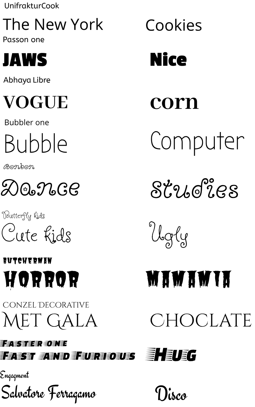 In this activity we were asked to write something in the fonts that are close to Serif, San Serif, Novelty, Monoscript and Handwritten.The sentence i write was Wareesha is nice.We had to compare the fonts that we had learned in class and the fonts that looked like them. 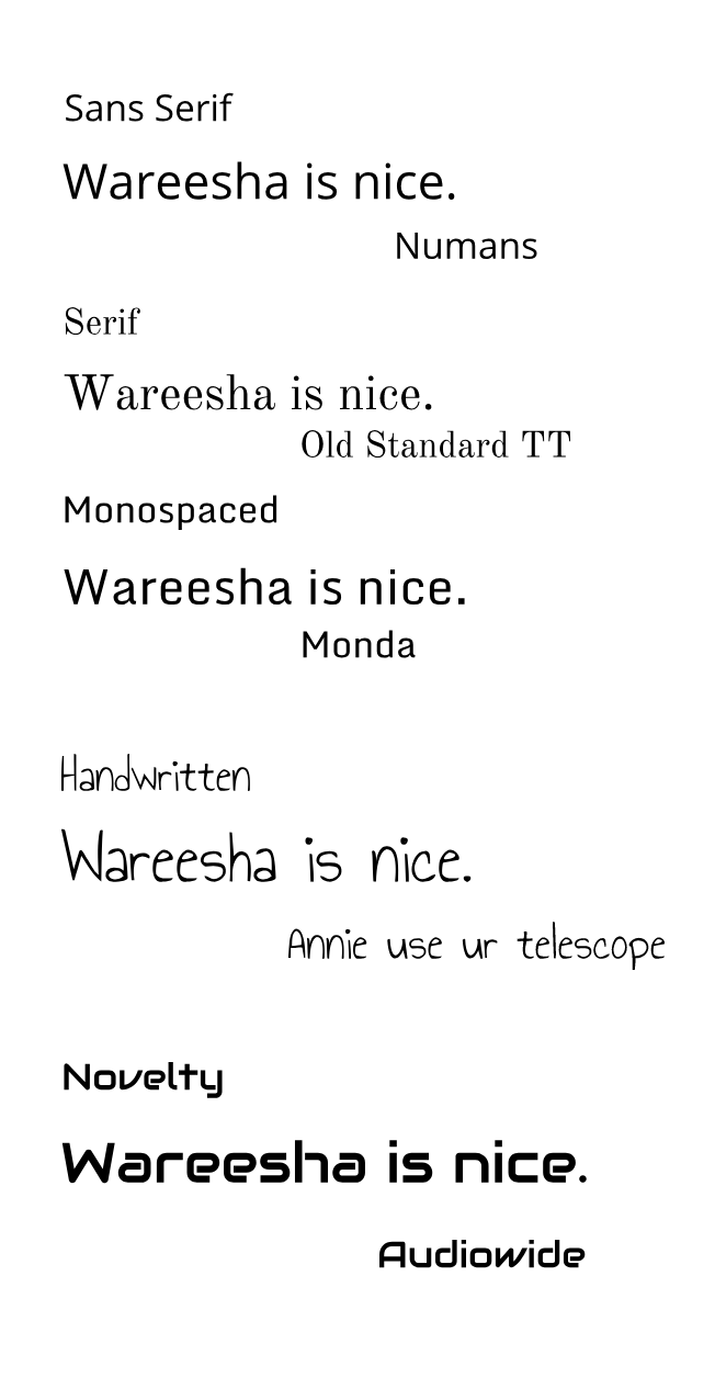 |
Archives
May 2019
Categories This work is licensed under a Creative Commons Attribution-NonCommercial-NoDerivatives 4.0 International License. |