|
In this activity we were supposed to use 10 fonts and write two words in the fonts, one of the word was supposed to match the font and the other was a word that would not match the font. 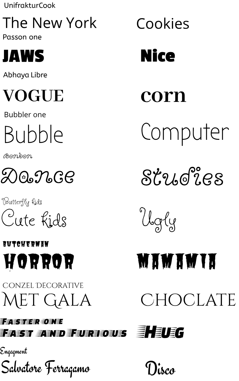
0 Comments
In this activity we were asked to write something in the fonts that are close to Serif, San Serif, Novelty, Monoscript and Handwritten.The sentence i write was Wareesha is nice.We had to compare the fonts that we had learned in class and the fonts that looked like them. 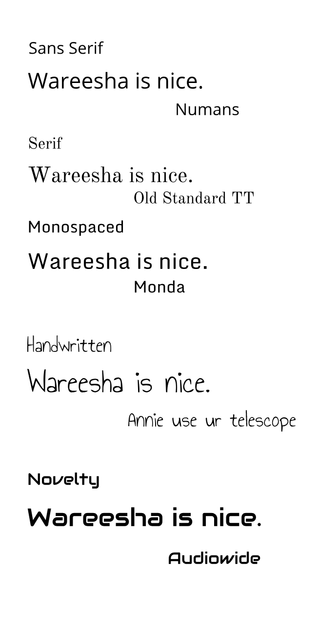 Typography is the art and technique of arranging type to make written language legible, readable, and appealing when displayed. The arrangement of type involves selecting typefaces, point sizes, line lengths, line-spacing, and letter-spacing, and adjusting the space between pairs of letters.Each font has a different personality and purpose, this means that every font has a different purpose and if you use the font for something else it won't look, appealing.I learned that typography is a way that we can express our selfs in a better way by using fonts and good typography reinforces the meaning of the text. The five fonts we learned in class were Serif, Sans Serif, Monospaced, Script/Handwritten, Novelty.
Serif: Have feet, they are used in large blocks of text and they are used in print. Sans Serif: Don't have the feet as Serif, they are good for small amounts like headlines of text and they are used on web. Monospaced: Each letter takes the same amount of space, Does not work well for large amounts of text and it is used in coding.Good for headings. Script/Handwritten: Can be diffuclt of read, Good for logos. Novelty: Good attention getters, their popularity comes and goes.Good for logos or headings. |
Archives
May 2019
Categories This work is licensed under a Creative Commons Attribution-NonCommercial-NoDerivatives 4.0 International License. |
